How to increase email campaign conversion rates with this CTA hack
June 16, 2022CTAs on outbound links are gold to newsletter publishers who want to increase their email conversion rates. Email conversion is the process that you would like your subscribers to take on after they have opened a link in your email. For example, you might want them to make a purchase or download a piece of content.
It’s important to understand and track how well your email campaigns are converting because they take a lot of resources to create. This is true whether you’re linking to content on your own website or to a third party.
According to a survey of over 3,000 newsletter publishers, 53% of respondents said it takes them more than two weeks to create a marketing email. If you’re not analyzing the performance of each email and looking for ways to improve, your team may be wasting valuable time.
That’s where CTA optimization comes in.
But before we dive into our expert tips on how to get the most conversions out of every email newsletter, let’s take a closer look at the biggest CTA hack your competitors don’t know about yet: CTAs on outbound links.
What are CTAs on outbound links?
The phrase ‘outbound links’ refers to webpage URLs that, when clicked or tapped, redirect a reader to a site that does not belong to you. Inbound links, on the other hand, link directly to a website owned by your brand.
With inbound links, you have complete control over the content displayed. That also includes CTAs on the page itself. Whether it’s an overlay, a link in the conclusion, or a sidebar asking visitors to subscribe, inbound links make it easy for newsletter publishers to control the next steps a reader takes as they make their way through the sales funnel.
But what about outbound links? Newsletter publishers are already familiar with curating third-party content for a campaign. Whether it’s to support a point within their own original copy or provide readers with a well-rounded collection of information from a number of reputable sources, outbound links are an important part of any newsletter.
The only problem with outgoing links is that once your newsletter reader clicks on it, they are directed to a completely different brand or website. And if they leave your newsletter to visit a third party, they are far less likely to return to your email or visit your brand’s website. They have essentially fallen out of the very sales and marketing funnel that your email campaign was meant to support.
The good news is that tools like Sniply have made it possible for newsletter publishers to add their own CTAs to any third-party website they link to. Not only does this make it possible to redirect readers back to your website but it also makes sure you’re getting the most out of every single link added to your campaign.
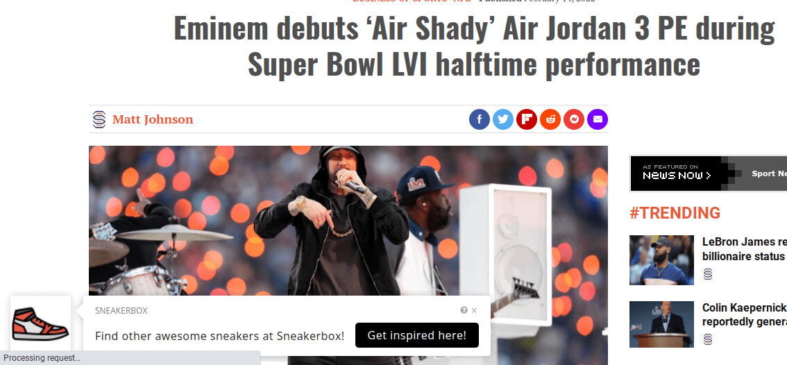
There are two ways to add a call to action to an outbound link placed in your email newsletter. The first is to add a CTA to the article page itself. Here’s what that looks like:
Source: Sniply
As you can see here, Sniply user Sneakerbox has linked to an article about Eminem’s new product. By placing a CTA on the outbound link, they were able to recapture the interest of their target audience with a related value proposition that will take them back to the Sneakerbox website. Had they not added this CTA, the customer journey would have ended as soon as the lead saw the new page title.
Sneakerbox also used Sniply to create an article preview page with their chosen CTA. Instead of directing readers to the third-party page, they were able to summarize the Eminem article on a unique landing page with the Sneakerbox URL and this same CTA.
Source: Sniply
Once the reader has reviewed the page, they only have one option for next steps: click on the Sneakerbox CTA. As you can see, this is a game changer for email publishers who want to maximize conversions and take advantage of every opportunity to redirect their audience towards their chosen CTA.
How to increase email newsletter conversion rate using your CTA
Increasing email newsletter conversion rates is a complex topic. There are many different elements in every email newsletter that you can use to achieve your goals. From attention-grabbing email subject lines to tailor-made content, email newsletters offer a wealth of opportunities for lead engagement. But perhaps the most important one of all is the CTA.
The CTA, or call to action, is the single most powerful conversion tool you have in any email newsletter message or campaign. Once your audience has gone to the trouble of opening your email and reading it, they’ll need to feel incentivized to take the next step. If they don’t, you will run the risk of losing a potential sale or even losing a newsletter subscriber. That is why your CTA design and copy are so important.
Here are the exact steps you need to take in order to fully optimize any email newsletter CTA:
Step 1: Use outbound link CTAs
Placing a CTA on a third-party website or a landing page that summarizes the third-party’s content while also using your own brand’s URL is nothing short of genius, if we do say so ourselves. This vital step is first because it’s the key to fully maximizing the potential amount of conversions on every email. Using outbound link CTAs saves publishers time they would spend writing original content to link to for each message. It also fully optimizes each campaign, making it easier than ever to achieve email marketing goals.
Leading outbound link CTA tools also make it possible for publishers to track their analytics on third-party websites so you’ll always know where they are and how they are performing.
Step 2: Shorten the URL
Your email newsletter CTA links to the URL of a landing page or website where the reader can perform an action. You know this already. But what many newsletter publishers overlook is the fact that the actual URL link itself is yet another opportunity for persuading their audiences.
Long, messy URLs lack legitimacy. But shorter, branded URLs increase your credibility, build trust among audiences, and are easy to remember long after readers have clicked out of your message.
To shorten your URL, simply copy and paste your CTA’s URL into a link shortening tool. From there you will be redirected to a section of the tool that allows you to:
- Choose which type of CTA you are creating
- Personalize the message copy
- Customize the CTA button text
- Create a shortened link for your CTA button
Source: Digital Reach Platform on YouTube
Step 3: Customize your link text
The key to writing the best shortened URL copy is to keep it simple yet specific. It should clearly communicate the topic of the page you’re linking to. For example, if your call to action is to book an expert consultation you can use straightforward phrases such as “contact” or benefits-focused descriptions like “teach me how”.
If you’re linking to a third-party page, make sure your CTA relates to the content in their article and provides a logical next step. In our Sneakerbox example earlier, the CTA (“Find other awesome sneakers at Sneakbox!”) connected back to the topic of the article (Eminem debuting new Air Jordans) and used the link text (Get inspired here!) to connect the two and provide a high-value offer worthy of the next click.
You can also create different shortened URL formats for different campaigns or target audiences to help organize all of your CTAs. For example, expert digital marketing agency Leap Works uses four different mechanisms for their shortened URLs and branded links:
- Leapworks.blog
- Leapworks.fun
- Leapworks.news
- Leapworks.link
Each category clearly sets up expectations for anyone who is interested in clicking on through. Leap Works says this approach helps them to organize the intent behind each link. Blogs links are meant to solve a business problem, fun links offer entertainment, news links share brand-related press, and link links directly to third-party content.
In their own words, “Using unique URL patterns for the different types of content you share is smart.”
Step 4: Add contextual keywords
Google states that URL structure should be clean yet descriptive to provide the best possible viewer experience.
Source: Google
The key is to use words or phrases that add context to the offer and the page they are being directed to. That’s where your keywords come in. Adding simple yet logical keywords to your shortened URL structure will make it simpler for newsletter subscribers to understand what they will see when they visit your page. Going back to the Sneakerbox outbound CTA, it’s easy to see why this tip works:
You can also use your shortened URL to connect the main idea of the newsletter to your corresponding offer on the inbound or outbound CTA.
Let’s say you are a business that offers a coaching program for female entrepreneurs. Your topic for this week’s newsletter is TikTok marketing and your offer is a free template for creating a social media marketing calendar.
Instead of linking your button text to a messy chain of random numbers and letters, you can customize the shortened URL to say any variation of “TikTok marketing calendar”, “social media marketing calendar”, or “TikTok for small business owners”.
Want a real-life example? As you can see, Google even does this with their own URL for the very same guide we just quoted:
This shortened version of their URL clearly states who the audience is (developers), the purpose of this page (advanced guidelines for search), and the topic you can expect to learn about once you click on it (URL structure).
Step 5: Use your brand colors
On their blog, web development agency Creative Whitt writes, “Cohesive design can also help increase customer conversions across various platforms.” They go on to say that it’s important for potential customers to have the “confidence that they are in the right place and that they should invest in your brand.”
Thanks to the prevalence of modern-day email scams, using branded colors to build credibility and drive conversions is especially important for links within your email campaign. So now that you have a shortened link with customized text, it’s time to connect the dots between your email campaign conversion tools and your big picture branding.
There are several areas of your CTA where you can add brand colors. For starters, if you’re linking within your content then there is the color of the text itself.
When a word or phrase is linked to another page, it automatically turns blue. While there is an advantage to using a familiar hue, you may want to customize it using an accent color from your brand’s profile.
Marketing expert and entrepreneur Neil Patel uses this tactic on his own blog. As you can see in the image below, Patel made the conscious decision to remove the default underline for internally linked text. He also swapped out the standard blue font color for his signature orange.
Source: Neil Patel
Want to turn your email newsletter CTA into a clickable button? Leading URL shortening tools typically offer this feature. The same branding and color rules apply.
Step 6: Track CTA performance
Now that you’ve put together a fully optimized CTA for your email newsletters you’ll want to send it out into the world and get feedback from real leads. To do this, go to the analytics section of your outbound CTA tool. It may look like this:
Source: Sniply
In this example, we see that there are 273 snips (or shortened URLs), all of which have received a total of 3,985 clicks and 359 conversions resulting in a 9.01% conversion rate. At first glance, we already know how our hypothetical email campaign is performing at a high level.
You can then focus on your conversion rate percentages by individual email. Drill down even further to explore the performance of individual CTAs within each email and compare them side by side to better understand what works or what doesn’t.
While there is a lot of debate around which key performance indicators are best for understanding email newsletter conversions, the above example gives us a clear picture of what we need to pay attention to the most.
The A’s to your email conversion rate Q’s
How do you engage newsletter subscribers?
If you want to engage newsletter subscribers you’ll need a winning combination of great content that is fully in tune with your audience’s needs, design elements that are interesting yet streamlined, and a CTA that is fully optimized with a shortened URL on both inbound and outbound links.
What is a good conversion rate for newsletters?
According to the Marketing Insider Group, the average click-through rate on a newsletter CTA is 17.8%. If you’re not at the percentage yet, don’t worry. Making use of every last customizable detail in your newsletter may help you reach or go beyond this figure.
How do you increase the conversion rate of a newsletter?
If you want to increase the conversation rate of a newsletter you first have to evaluate what’s working and what isn’t according to your available data. URL shortening tools such as Sniply offer insightful Dashboards that gather data on managed links which include clicks, conversions, and verified conversions for CTAs on third-party websites.
Increase email campaign conversion rates with Sniply
While there are a lot of ways to increase email campaign conversions but optimizing your CTA is the most impactful. Newsletter publishers should take advantage of every customizable feature made available to them through tools like Sniply.
With Sniply, users can quickly create CTAs on outbound links, improve search engine optimization for connected landing pages, and create informative URLs using contextual keywords.
Start your free trial with Sniply today to see how you can hack your email newsletter CTAs on all outbound links and get more conversions on your next campaign.

