22 Tips for Creating a Viral Infographic
March 11, 2021Ever since the rise in their popularity, infographics are everywhere. You see them on blogs, social media, research organizations, and branded content; but it doesn’t end there. So if infographics are this prolific throughout the interweb, how do you create a creative infographic that stands out from the rest?
There are many elements that factor into what makes a great infographic including the color coordination, the typographic, the structure, skimmability, and more. You also need to consider what topic you’re going to cover and which statistics are going to be the most compelling to highlight. But It’s more than just the infographic itself, how you distribute the infographic is just as, if not more important than the design elements.
Since there are so many components that make up a viral infographic, we put together this guide to help walk you through the process to make the best infographic that’s inherently sharable online.
Infographic Preparation Phase
The preparation phase of creating a great infographic is key to laying the foundation for an infographic with viral potential. This is where you decide what topic the infographic will focus on, what data is important to display, which industry influencers you’re going to quote, etc. If you start off strong in the preparation phase, it will make the rest of the process go much smoother. Here are the key steps that are crucial to a strong infographic preparation phase:
- An Effective Topic: Choosing a compelling topic is a tricky step for many reasons, one reason being that when you choose a topic, you need to ensure that your infographic is approaching the subject from a different angle than past infographics have done. You also need to decide on a topic with an audience in-mind such as the target demographic for your business.
- The Infographic’s Core Insight: Determine what insight is at the heart of your infographic that drives what kind of data you will include and why it matters.
- Statistics: Not only do you need to decide on the stats you’re going to include in your infographic but you also need to make sure the data digestible. By that, we mean that it’s easy to skim and understand.
- Cited Sources: Always choose sources from credible outlets like research organizations, scientific journals, educational institutions, etc. to cement the trust of your viewers.
- SEO Optimized Infographic: Identify the best keywords to use in your infographic that people are most likely to search for online. You can do this by using SEO tools to do keyword research and by simply searching online yourself. See what related searches appear at the bottom, take a look at Google’s “People Also Ask” section, and see what keywords top ranking sites are using. Once you have your infographic keywords, you’ll want to make sure they are used in the infographic image and the corresponding content. Don’t forget to also use these keywords in the infographic’s file name and image alt text.
Infographic Designing Phase
Now that all of the upfront legwork is finished, it’s time for the fun part: designing the infographic. This is where you, or your designer, get a chance to let your creative side shine to make those key insights easy to absorb and understand through the use of beautiful imagery. Here are the steps you need to follow that are vital to designing a viral infographic:
- Infographic Size: Research has shown that information graphics that are 9x longer than they are wide are shared the most. This doesn’t mean you’re required to make your infographic this size specifically, it’s just a recommendation.
- Easy to Scan: Arguably the most important step of designing an infographic is to make it as easy to scan through as possible. You want people to be able to engage with the information quickly before they get bored or confused and move on to something else. Have friends or colleagues take a look at the infographic before you post it to get their feedback, or create an A/B test and survey people with their responses to find the best design and layout for your infographic.
- Choose a Powerful Headline: In the short number of characters you use in your headline, you need to convince the viewer to continue to read on, past the headline. Intrigue the reader, pose a question they want to answer, use the headline to tell the user why it matters to them.
- Using a Number in the Title: One of the best ways to interest a reader at the start of your infographic is to use a number in the title. That number could be anything from a percentage to a ratio, or even the number of tips the infographic provides. Adding a number to your headline increases the chances of your infographic being viewed by 36% according to BD Ventures. And odd numbers have a 20% higher click-through rate than even numbers.
- A Striking Header Image: Often times the header image is the part of the infographic that is above the fold on a web page or blog post, so it’s important to draw the reader in with whatever you use in this key piece of real estate. Make it a section that is easy to use as a feature image for the infographic when shared on social media, in a CTA, or a button.
- Infographic Navigation: One way to make sure an infographic is easy to scan and navigate is to use numbered navigation throughout the infographic. This gives viewers an idea of how much information they have covered and how much remains.
- Distinct Infographic Sections: Divide up the information you plan to use in your infographic into organized sections of related data. This is yet another way to make your infographic easy to browse and comprehend.
- Attention-Grabbing Statistic Display: Make sure to start out your infographic with the best quotes or key pieces of statistical data you want the reader to notice first. If it information you believe will hook the reader, display it in a way that is eye-catching to increase the chance they will read on.
- Use Typography that is Easy to Read: An infographic is not the place to use a typeface that is visually complex or difficult to read because of how fine the characters are. Choose a font that looks clean, crisp, and is as easy as possible to read, no matter what color the text is.
- Efficient Word Use: Obviously, the focus of the infographic shouldn’t be the text, it should be the images and data displays. That’s what makes infographics so appealing is the ability to consume information without reading a boring blog of words. Imagery is much more exciting for the human brain to interact with than words are.
- Visual Variety: Since the visuals are an infographic’s main attraction, be sure to spice up the imagery to add some variety to the infographic. Try to avoid using multiple graphs of the same type and instead find a new way to convey the data. Use unconventional ways to display metrics that tie-in to the theme of the infographic.
- Infographic Color Coordination: Masterful color coordination can truly make a great infographic stand out from an average infographic. Try to not only choose colors that blend nicely together but also choose color pallets that differentiate your infographic from other infographics covering similar information. When choosing colors to use in your infographic, sometimes it’s important to choose hues that fit with your brand’s design style but that’s not always the case.
- Using Animation or Motion Graphics: Nothing catches the eye like motion and animated graphics, so if you’re savvy enough to include them in your infographic in a way that flows and feels natural, you’re more likely to stand out. Not only that but adding motion graphics and animations also makes your infographic more memorable.
- Fast Loading Time: The last step of the design process is to ensure that the page used to display your infographic isn’t slowed down by the time it takes to load the image. Use tools online to optimize the infographic image for a fast page loading time.
Infographic Promotion Phase
Your eye-catching creative infographic is ready, it’s live on your website or blog, and it’s ready for the online community to marvel at the insights it presents. Now you just need to make sure the right people get the chance to see your infographic because if no one sees it, no one can share it with others. There are the essential actions you need to take to effectively promote your infographic online:
- Easy to Share: You want to make it as easy as possible for viewers to share your infographic including having social sharing buttons for any relevant social networks, providing a feature image for people to use, and offering a shortened URL for the infographic.
- Social Media Marketing: Share your infographic on your social media accounts and work with industry influencers to spread the word about your infographic.
- Infographic Directories and Blogs: Take advantage of the vast number of infographic directories and blogs devoted to infographics. Many make it very easy to submit your infographic and are able to upload them within a week to a few months.
By following these 22 steps to create your infographic, you are more likely to design a creative infographic people are compelled to share with others. It’s hard to guarantee that your infographic will go viral but steps are sure to set your infographic up for success.
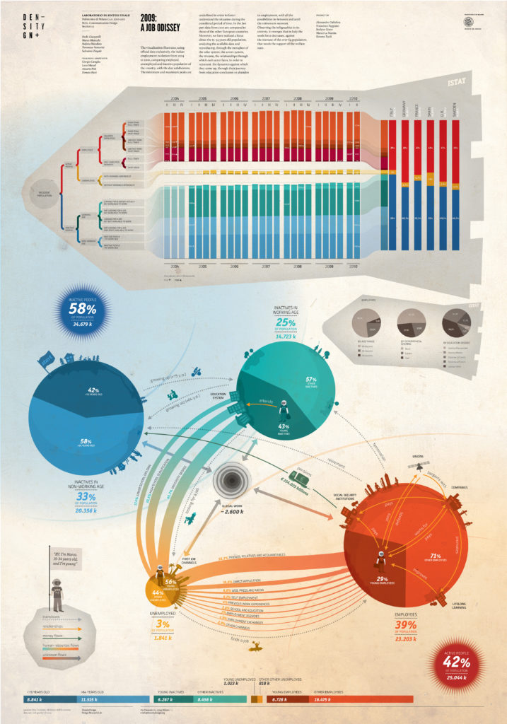
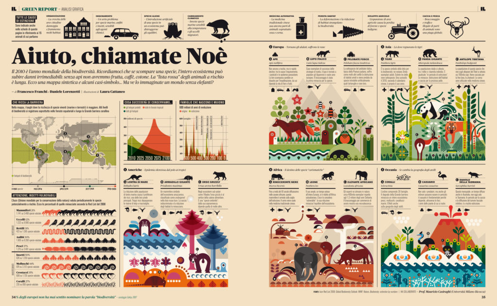
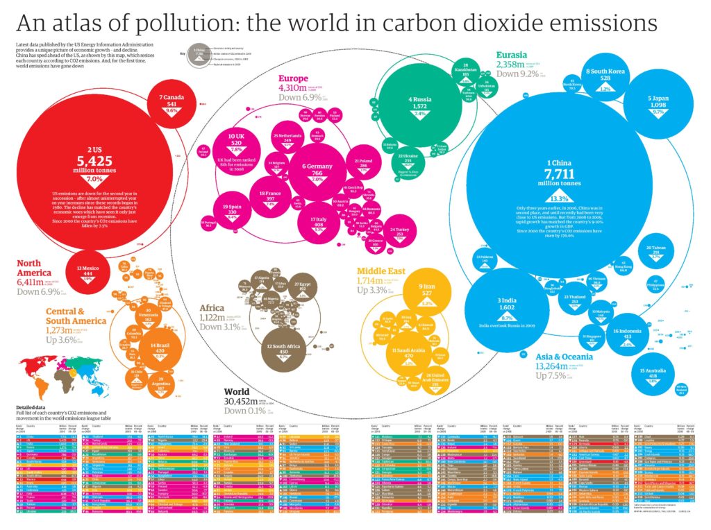
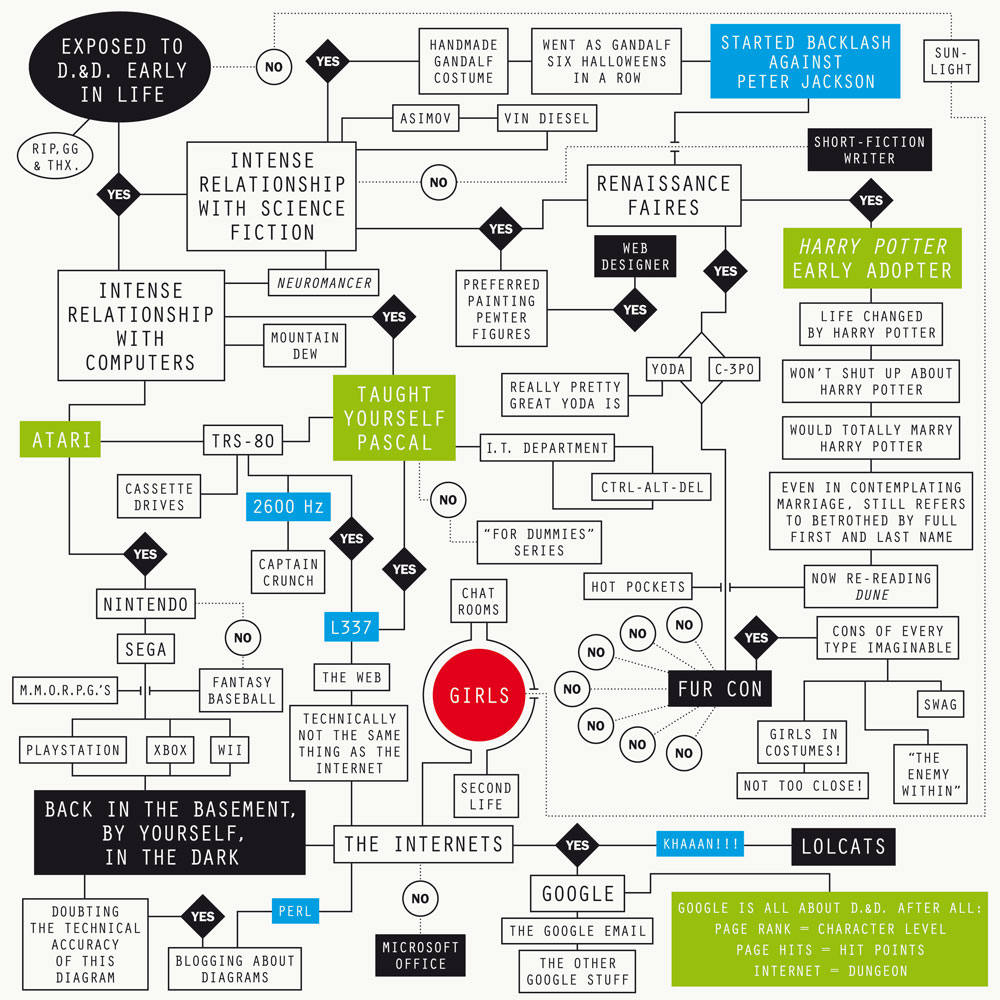
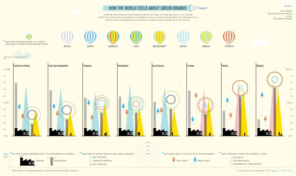
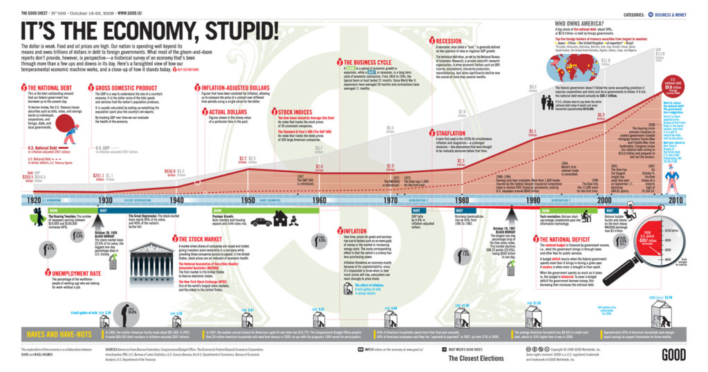
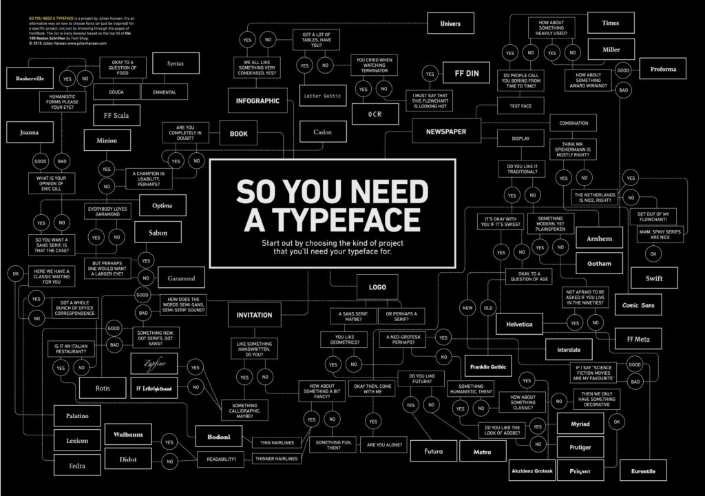
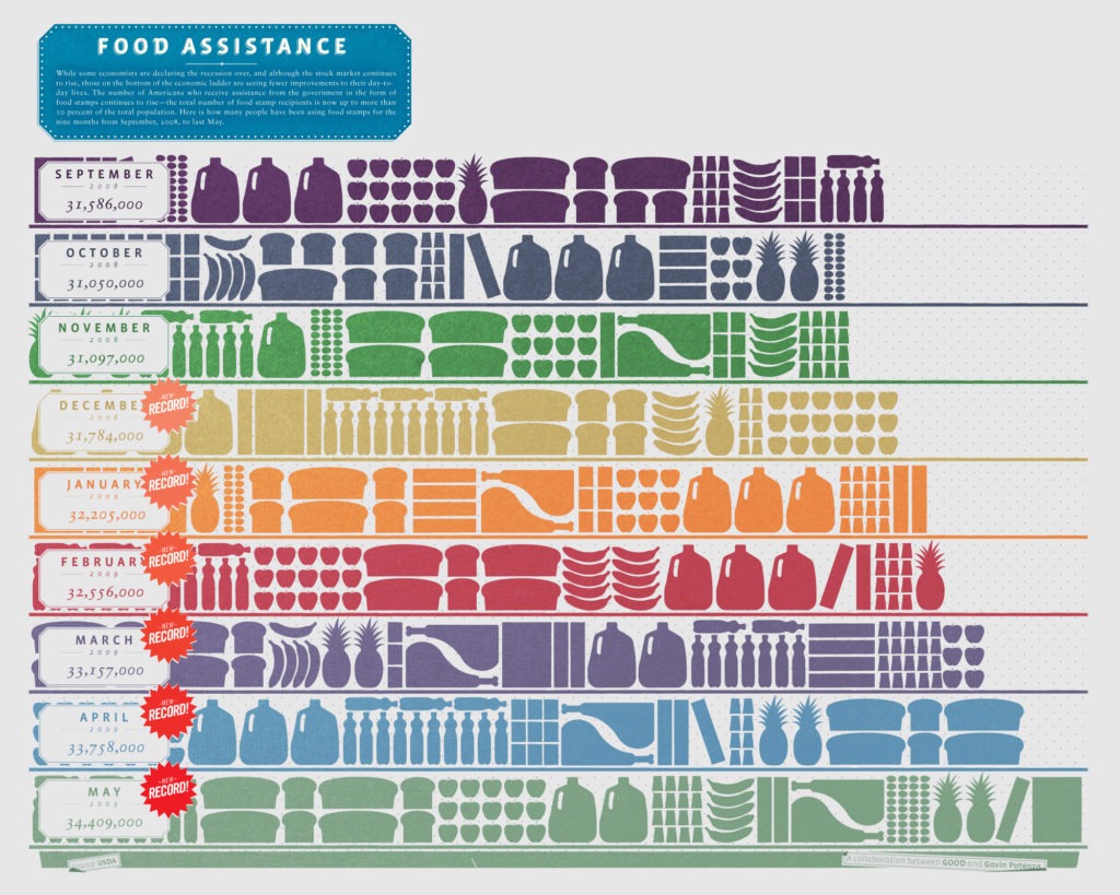
If you need a little extra infographic inspiration, check out these 9 amazing infographics:

