The Pheonix Effect: Birth of a New Logo
July 9, 2014A logo is a visual representation of your organization that makes your brand distinguishable from others. Before you begin the sketching process of creating a logo, it is important to know the significance of having one and the value of the research needed for an effective logo.
Being in the conversation revolving around the product, really helped me gain a better understanding of who the target market is, improving my knowledge of the product and what value it can offer. It certainly helps to have been there from the beginning of a startup. It is a great advantage knowing the company inside out and how it all began. That does not mean I can escape the process of conducting research. It is still important to pinpoint your direct and indirect competitors. Looking at a database of existing logos can be advantageous as well, but just make sure it’s not as your main source of inspiration.
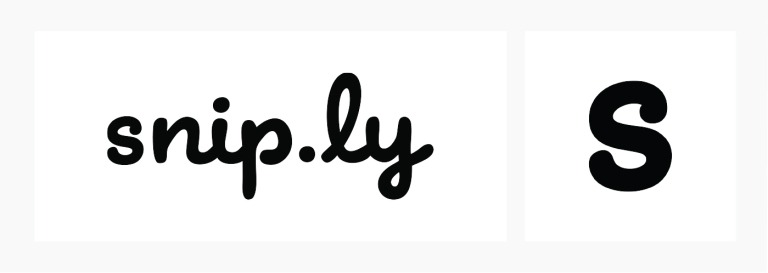
So, at the beginning of Sniply, we threw together a simple logo using the font Mister Brown. It’s a modern cursive that embodied a sense of friendliness and whimsy. Because it was only a wordmark, it became awkward in applications such as an icon or a profile image. Fitting the entire name left too much white space and taking just the first letter reminded me of every other startup that placed the first initial in a box. It also had a slight resemblance with Comic Sans font.
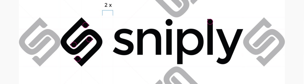
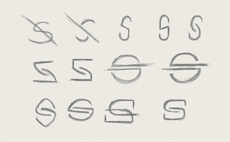
With a new approach in mind, I began exploring ways to create an ownable mark that would work great at delivering a simple graphic message. The logo mark came about through some abstract sketching, trying to combine the letter “S” and a link icon. You can see below how the mark came to its final form. Thumbs up for sketching on FiftyThree’s Paper app!
Next, came the fun part — digitizing my sketch! There are many ways to approach this. Many like to scan their sketch and import it into Illustrator. While others, like me, just start creating it from scratch with geometric shapes. I usually do the latter, unless I am dealing with something more intricate. I wanted to create the first half of the ‘link’ shape in the logo and what I noticed was that it somewhat resembled the letter ‘D’. So I browsed through my font library for a ‘D’ with a longer bowl horizontally and Venera did just that. After that, it was just the nitty-gritty stuff like taking the inner curve of the ‘D’ the carve out the hooks of the logomark. What gives Sniply an iconic look is the little details, such as, the placement of the Bézier curves and adding it on the ‘L’ to give it a unique personality.
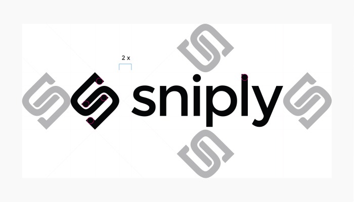
For the wordmark, I knew I wanted something functional and contemporary. I came across Montserrat and just fell in love with this typeface. I definitely have a soft spot for geometric style of type.
The whole process has been an absolute joy and I can’t wait to see a plethora of applications with this logo to come!
About the Author

Sophia Yip, Design Gal at Sniply
Sophia likes pretty things. In fact, she dedicates her life to making things pretty. So if you ever wonder why Sniply looks so good, it’s all her magic! Sophia used to design for TEDx and DDB, both highly reputable organizations, until we stole her away!